Educational content only. Not financial advice. Always do your own research. See full Disclaimer.
Learning how to read a stock chart is one of those skills that quietly changes everything. Before it clicks, the market feels like a wall of random numbers. After it clicks, a chart becomes a story you can actually follow. The first time you open one, the squiggly lines and colored bars look like static. That's normal. By the time you finish this guide, you'll know what each piece means: the price and time axes, the different chart styles, how the timeframe changes what you see, what volume is quietly telling you, and how to spot trends, support, and resistance. And no, you don't need math or a finance degree. You just need someone to point at the right things.
The anatomy of a chart: price (y-axis) and time (x-axis)
Every stock chart is really just two things plotted against each other. The vertical axis (the y-axis) shows price, meaning how many dollars one share costs. The horizontal axis (the x-axis) shows time, running from the past on the left to right now on the far right. Higher on the chart means a higher price. Further to the right means a later moment. That's genuinely all there is to the frame.
Connect those points and you get the line everyone recognizes as "the stock going up or down." So when someone says a stock "went up today," all they mean is that the dot on the right sits higher than the dot from earlier. Reading stock charts really does start this simply. Get comfortable with the two axes, and everything else stacks on top of them.
Line charts vs. bar charts vs. candlestick charts
The exact same price data can be drawn a few different ways, and each style shows a bit more detail than the one before it.
- Line chart: the simplest view. It links one price per period (usually the closing price) into a single clean line. Perfect for seeing the overall direction without clutter.
- Bar chart: each period becomes a vertical bar showing four prices, the open, high, low, and close. A tick on the left marks where price opened, and a tick on the right marks where it closed.
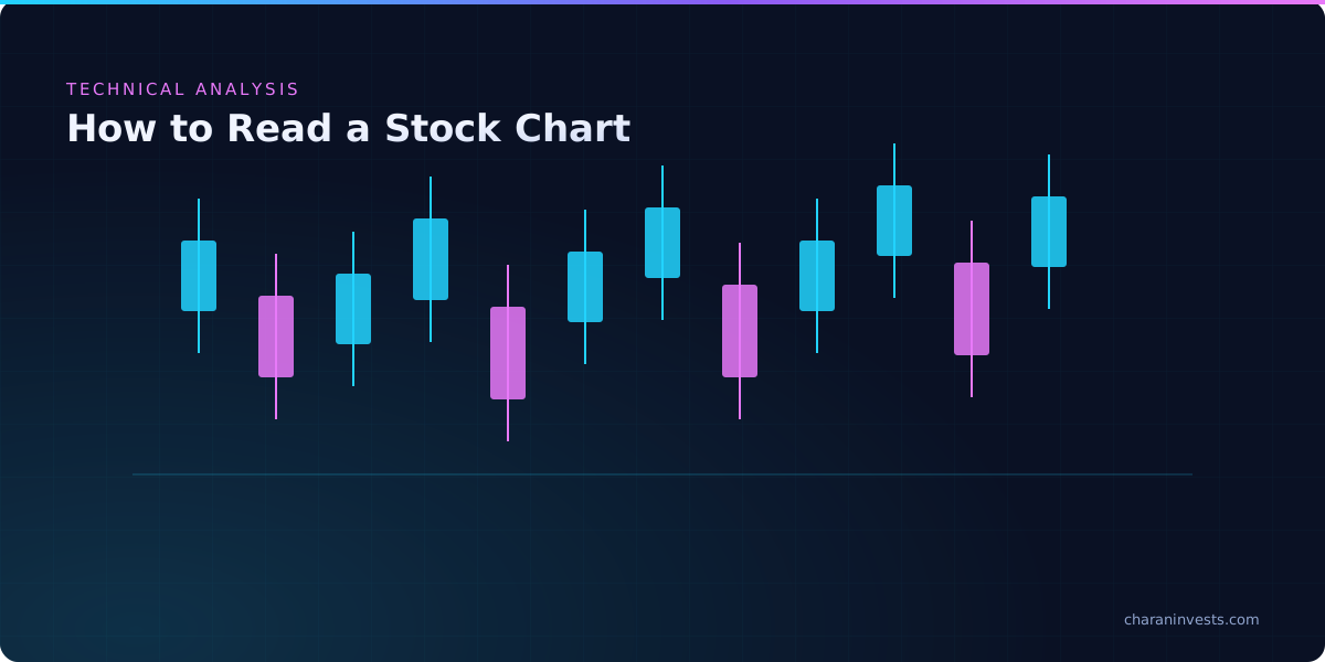
- Candlestick chart: the favorite among active traders. Like a bar, each candle shows the open, high, low, and close, but it uses a colored "body" so you can read the move instantly, usually green when price closed higher and red when it closed lower.
If you're brand new, start with line charts to train your eye on direction alone. Once that feels easy, candlesticks pack a lot more information into the same space, which is why we go deep on them in our guide to candlestick patterns for beginners.
A chart won't predict the future. It just maps every decision buyers and sellers have already made.
Choosing a timeframe: daily, weekly, intraday, and why it changes the story
One of the most common beginner slip-ups is forgetting to check the timeframe. The same stock can look like it's crashing on a five-minute chart and quietly climbing on a weekly one. Neither view is lying. They're just different zoom levels on the same picture.
Each candle or bar represents one unit of whatever timeframe you've picked. On a daily chart, one candle is one trading day. On a weekly chart, one candle covers a full week. On an intraday chart like five-minute or one-hour, each candle covers just minutes or hours inside a single session.
A simple way to think about which to use:
- Longer timeframes (weekly, daily): best for reading the overall trend and for longer-term investing. Less noise, fewer false signals.
- Shorter timeframes (hourly, five-minute): used by short-term traders who need to see every detailed move within a day. More noise, more decisions to make.
Keep in mind the US market is open 9:30am to 4:00pm ET, so intraday charts only fill in during those hours. Getting comfortable with timeframes early saves you a ton of confusion later, especially when you're comparing your screen to somebody else's screenshot.
Reading volume: the fuel behind every price move
Under the price, most charts show a row of vertical bars. That's volume, the number of shares traded during each period. If price tells you where a stock went, volume hints at how much conviction was behind the move.
So what is volume actually signaling? Think of it as a headcount for participation:
- A big price move on high volume suggests strong agreement, because lots of buyers or sellers are involved, so the move carries more weight.
- A move on low volume tends to be weaker or less reliable, since fewer people are behind it.
- A sudden spike in volume often shows up around news, earnings, or moments when the mood shifts.
There's nothing to memorize here. Just build the habit of glancing at volume whenever price does something dramatic, and ask yourself one question: did a lot of people show up, or only a few?
Spotting the trend: uptrend, downtrend, and sideways
A trend is just the general direction price has been heading over time. There are only three of them, and learning to name them is one of the most useful things a beginner can do.
- Uptrend: a series of higher highs and higher lows. The chart stair-steps upward.
- Downtrend: a series of lower highs and lower lows. The chart stair-steps down.
- Sideways (or "ranging"): price bounces around inside a flat zone without making real progress either way.
Trends tie directly into the bigger mood of the market. Once you understand the difference between a bull and bear market, individual stock trends start making a lot more sense in context. One rule of thumb worth burning into memory: zoom out before you judge a trend. A one-day dip inside a long uptrend is a completely different animal from the start of a fresh downtrend.
Support and resistance: the price 'floors' and 'ceilings'
Support and resistance click fastest with a simple mental image: floors and ceilings. Support is a price level where a stock has repeatedly stopped falling and bounced back up, like a floor catching it. Resistance is a level where it has repeatedly stopped rising and turned back down, like a ceiling shoving it away.
Why do these levels matter? Because they mark prices where buyers or sellers have shown up before, and they tend to show up there again. Traders watch these zones closely:
- When price approaches support, traders watch to see whether buyers step in again and hold the floor.
- When price approaches resistance, they watch to see whether sellers cap the move at the ceiling.
- When price clearly "breaks through" one of these levels on strong volume, it can signal a real shift.
Here's a bonus idea that trips a lot of people up: a broken ceiling often turns into the new floor. When a stock pushes above old resistance, that former ceiling can flip and start acting as support the next time price pulls back to it.
Trendlines and moving averages, explained simply
Two beginner-friendly tools make trends much easier to see: trendlines and moving averages.
Trendlines
A trendline is just a straight line you draw connecting a run of higher lows (in an uptrend) or lower highs (in a downtrend). It turns a messy chart into a clean picture of direction, and it hands you a level to watch. When price breaks a trendline it's been respecting for a while, people tend to notice.
Moving averages
A moving average smooths out the noise by plotting the average closing price over a set number of periods. A 50-day moving average, for example, plots the average of the last 50 daily closes and updates each day. Instead of reacting to every little jiggle, you get one flowing line that sums up the recent trend.
- When price sits above a rising moving average, that generally reflects an uptrend.
- When price sits below a falling moving average, that generally reflects a downtrend.
- Shorter averages (like the 20-day) react quickly. Longer ones (like the 200-day) move slowly and show the big picture.
These tools don't forecast anything. They organize what's already happened so your eye can focus. That's really what technical analysis is: not magic, just structure.
From reading charts to reading candlesticks: your next lesson
Once the anatomy of a chart clicks, the natural next step is learning to read individual candles, those small but powerful signals inside each period. That's exactly where candlestick patterns for beginners picks up, teaching you what the shapes and colors of single candles can hint about momentum.
It's also worth remembering that charts are only half the story. A chart shows you what price is doing, while company financials tell you why a business might be worth owning. If you're curious how those two fit together, our breakdown of fundamental vs. technical analysis shows where each one shines and how thoughtful investors lean on both.
The fastest way to get fluent is to look at real charts every day and talk them through with people learning right alongside you. That's what we do in the Charan Invests community, a free Discord with 34,000+ beginner investors breaking down charts together, asking questions without any judgment, and moving at their own pace. You can also see how we put these ideas to work on our trades page, which is a nice way to connect the theory to real examples.
Keep learning
Want to watch these concepts in motion? A short video can make the axes, candles, and trends click even faster. Try searching "how to read a stock chart for beginners" and follow along with a couple of charts open on your own screen.
This article is educational content only and is not financial advice. Investing involves risk, including the possible loss of capital.
Frequently Asked Questions
Start with the two axes: price runs up the vertical (y) axis and time runs along the horizontal (x) axis, with the most recent moment on the right. Next, check the timeframe (daily or weekly, say), glance at the volume bars under the price, and look for the overall trend, whether it's up, down, or sideways. Once those basics feel natural, you can layer in tools like support and resistance levels or moving averages.
Volume is the number of shares traded during each period, usually shown as bars beneath the price. It tells you how much participation or conviction is behind a price move. A big move on high volume suggests strong agreement among traders, while the same move on low volume is generally treated as weaker or less reliable.
Support is a price level where a stock has repeatedly stopped falling and bounced back up, acting like a floor. Resistance is a level where it has repeatedly stopped rising and turned down, acting like a ceiling. These zones matter because buyers and sellers have reacted there before and often do again, and a clean break through one can signal a real shift.
There isn't one best timeframe, since it depends on your goal. Longer timeframes like weekly and daily charts are better for seeing the overall trend and suit longer-term investing because they carry less noise. Shorter timeframes like hourly or five-minute charts show detailed intraday moves and get used by short-term traders, but they come with more noise and more decisions.
A line chart connects a single price per period (usually the close) into one clean line, which makes the overall direction easy to see. A candlestick chart shows four prices per period, the open, high, low, and close, using a colored body, so it reveals far more detail about each move. Beginners often start with line charts for clarity and switch to candlesticks as they get comfortable.
Apply it live
Learn with 34,000+ beginners
Every lesson gets discussed live in the free Discord. Bring your questions and learn from real market moves.
Join Free Discord →Explore VIP